
קהילת Lovable Israel — המרכז ללמידה ובנייה ב-AI
מדריכים
מדריכים פרקטיים שלב-אחר-שלב לבניה עם LOVABLE
מחפש ועד מערכות מתקדמות, פרומפטים חכמים, חיבורים ל-DB, אוטומציות, עיצוב, ודיבוג.
מאמרים
מאמרים, חדשות ועדכונים מעולם LOVABLE וה-AI
פיצ׳רים חדשים, שינויים בפלטפורמה, טיפים מתקדמים, ניתוחים, ועדכוני מערכת.
ספריית פרומפטים
פרומפטים מוכנים לשימוש מיידי ב-LOVABLE
עיצוב, פיצ׳רים, אינטגרציות, סופהביוס, תיקון באגים ומערכות שלמות.
תמיכה וקהילה
הקהילה הישראלית למשתמשי LOVABLE בישראל נמצאת בפייסבוק.
הצטרפו עוד היום :)
מדריכים אחרונים
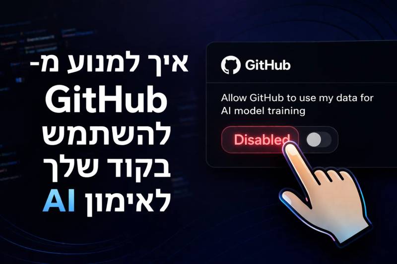
איך למנוע מ־GitHub להשתמש בקוד שלך לאימון AI
מדריך שמסביר איך למנוע מ־GitHub להשתמש בקוד ובאינטראקציות שלך לאימון מודלי AI של copilot.
קרא עוד
פתיחת פרויקט חדש ב־Lovable
בפעם הראשונה שנכנסים ל־Lovable.dev, זה נראה כמעט קסם – פשוט כותבים מה שרוצים לבנות, והמערכת מתחילה לבנות את זה בשבילך. אבל כדי להתחיל באמת לבנות אתר, צריך קודם לפתוח פרויקט חדש. הנה בדיוק איך עושים את זה, צעד אחר צעד.
קרא עוד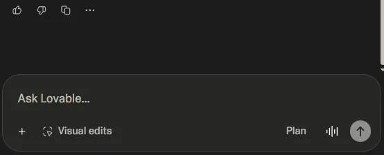
מבנה שדה ההקלדה (Prompt Bar)
השדה הזה הוא נקודת החיבור שלך עם הבינה של Lovable – כל שינוי, רעיון או פקודה מתחילים כאן.
קרא עוד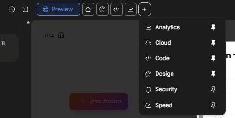
האייקונים של הדשבורד - צד שמאל
בדשבורד של המערכת ישנם כמה אייקונים שכל אחד מהם הוא עולם ומלואו. במאמר הבא - נסביר בקצרה על כל אחד מהם
קרא עוד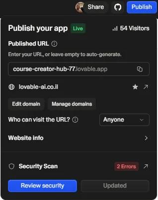
האייקונים של הדשבורד - צד ימין
עכשיו אנחנו מתמקדים בצד שמאל של הסרגל העליון בממשק של Lovable - שם נמצאים כפתורי השיתוף, הסנכרון ל־GitHub והפרסום של האתר. הנה הסבר מדויק על כל אחד מהם לפי התמונות שצירפת:
קרא עוד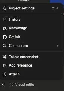
(PROMPT BAR) כפתור ה+ בצד שמאל
זה התפריט שבו אנחנו שולטים בכל מה שקורה מאחורי הקלעים של הפרויקט – משם ננהל חיבורים, נוסיף קבצים, נצלם מסך, נחזור לגרסאות קודמות ונגדיר בדיוק איך הכל עובד. כל הכלים החזקים במקום אחד.
קרא עודספריית פרומפטים
פרומפטים ותבניות לשימוש עם Lovable
תוסף נגישות מתקדם לאתר
תוסף נגישות מתקדם עם המון פונקציות של נגישות שנדרשות בתקן הישראלי
You are one of the world's leading Accessibility Engineers.

Your task is NOT to explain.

Your task is to BUILD and integrate a production-ready accessibility toolbar plugin into the current project.

The output must be COMPLETE working source code.

Do not write documentation instead of code.

Do not summarize.

Do not stop until the entire plugin is complete, integrated and working.

====
GOAL
====

Build the most advanced open-source accessibility toolbar possible for the current website.

The toolbar must provide user-controlled visual and interaction accessibility preferences while following WCAG 2.2 AA best practices.

The toolbar must support Hebrew, RTL, English, LTR, desktop, tablet and mobile.

Never claim that the toolbar alone makes a website legally compliant.

Never claim that installing the toolbar guarantees compliance with:

WCAG

Israeli Standard SI 5568

EN 301 549

Any accessibility law or regulation

Never fake accessibility.

Do not automatically alter the website's semantic HTML.

Do not automatically invent alt text.

Do not automatically generate labels.

Do not automatically repair inaccessible ARIA.

Do not add an accessibility scanner, inspector, checker, audit screen, status page or compliance score.

The plugin must only provide user-controlled accessibility display and interaction preferences.

=============
PRIMARY TASK
=============

Inspect the current project.

Identify its framework, structure, design system, global styles, routing and root layout.

Build the complete accessibility toolbar.

Integrate it globally so it appears on all relevant public pages.

Preserve all existing functionality.

Preserve all existing routes.

Preserve all legal pages.

Preserve all privacy pages.

Preserve all SEO configuration.

Do not create a separate route for the toolbar.

Do not create an accessibility status page.

Do not create an admin dashboard.

Do not replace the current application architecture unnecessarily.

====
TECH STACK
====

Use the existing project stack whenever possible.

Preferred implementation:

React

TypeScript

Tailwind CSS

Vite or the project's existing build system

ES Modules

Tree Shaking

Zero dependencies whenever reasonably possible

If lucide-react is already installed, use its Accessibility icon.

If lucide-react is not installed, do not install it solely for one icon.

Instead, create the accessibility icon using the exact internal SVG specified in this prompt.

Use 100% TypeScript.

Do not use any.

Do not use @ts-ignore.

Do not use @ts-nocheck.

Do not weaken strict TypeScript settings.

Do not use dangerouslySetInnerHTML.

Do not use eval.

Do not use new Function.

======
CORE FEATURES
======

Implement all of the following:

Floating accessibility button

Beautiful animated accessibility panel

Hebrew support

English support

RTL support

LTR support

Dark mode support

Mobile support

Tablet support

Desktop support

Keyboard navigation

Screen-reader support

Persistent user preferences

Cross-tab synchronization

Reset all settings

Accessible live announcements

Responsive layout

Style isolation

Safe unmount cleanup

Server-side rendering safety where applicable

===
VISUAL ACCESSIBILITY FEATURES
===

Implement all of the following working controls:

Increase text

Decrease text

Reset text size

Readable font

Increase letter spacing

Increase word spacing

Increase line height

Pause animations

Reduce motion

Grayscale

High contrast

Dark contrast

Light contrast

Invert colors

Highlight links

Highlight headings

Reading guide

Reading mask

Large cursor

Enhanced focus highlight

Hide images

Reset all accessibility settings

Every control must work.

Do not create placeholder buttons.

Do not create non-functional controls.

Do not simulate behavior.

Do not return mock implementations.

====
FORBIDDEN FEATURES
====

Do not build an accessibility scanner.

Do not build an accessibility inspector.

Do not build a checker tab.

Do not build an audit tab.

Do not build an issues tab.

Do not build an errors tab.

Do not build an accessibility score.

Do not build a compliance score.

Do not build a violation counter.

Do not build an automated repair engine.

Do not create a separate accessibility status page.

Do not scan the host website for accessibility violations.

Do not detect or report:

Images without alt text

Buttons without accessible names

Missing form labels

Low contrast

Skipped headings

Keyboard traps

Duplicate IDs

Missing document language

Invalid ARIA

Empty links

Inaccessible dialogs

Do not generate reports about the website.

Do not display a "בודק נגישות" tab.

Do not display an "Accessibility Checker" tab.

Do not display an "Inspector" tab.

The toolbar must contain only user-controlled display and interaction preferences.

===
FLOATING ACCESSIBILITY BUTTON
====

Create a premium floating accessibility button matching this exact visual direction:

Circular blue button

White wheelchair-style accessibility icon

Soft blue shadow

Clean minimalist appearance

Enterprise-quality UI

Positioned at the bottom-right corner by default

48px size on mobile

56px size on desktop

Slight hover scale animation

Strong visible keyboard focus ring

No visible border

High contrast

Large accessible touch target

Use this default color:

#0B7FB3

The icon must be white.

The floating button must visually match this approximate Tailwind design:

fixed
bottom-4
right-4
z-[95]
inline-flex
h-12
w-12
items-center
justify-center
rounded-full
bg-[#0B7FB3]
text-white
shadow-lg
shadow-[#0B7FB3]/30
transition-transform
duration-200
hover:scale-105
focus-visible:outline
focus-visible:outline-[3px]
focus-visible:outline-offset-2
focus-visible:outline-[#0B7FB3]
md:h-14
md:w-14

The button must include:

type="button"

aria-expanded dynamically reflecting whether the panel is open

aria-controls="a11y-panel"

aria-haspopup="dialog"

aria-label using the localized accessibility label

title using the localized accessibility label

Hebrew default label:

אפשרויות נגישות

English default label:

Accessibility options

The default implementation must be functionally equivalent to:

<button
  ref={buttonRef}
  type="button"
  aria-expanded={isOpen}
  aria-controls="a11y-panel"
  aria-haspopup="dialog"
  aria-label={labels.accessibilityOptions}
  title={labels.accessibilityOptions}
  onClick={togglePanel}
  className="
    fixed bottom-4 right-4 z-[95]
    inline-flex h-12 w-12 items-center justify-center
    rounded-full bg-[#0B7FB3] text-white
    shadow-lg shadow-[#0B7FB3]/30
    transition-transform duration-200
    hover:scale-105
    focus-visible:outline
    focus-visible:outline-[3px]
    focus-visible:outline-offset-2
    focus-visible:outline-[#0B7FB3]
    md:h-14 md:w-14
  "
>
  <AccessibilityIcon
    className="h-6 w-6 md:h-7 md:w-7"
    aria-hidden="true"
    focusable="false"
  />
</button>

Do not use gradients on the floating button.

Do not use a gear icon.

Do not use a help icon.

Do not use an information icon.

Do not use an emoji.

Do not use text inside the circular button.

Do not use an image file for the icon.

Do not make the button transparent.

Do not make the button square.

Do not remove the visible focus ring.

Do not place inaccessible tooltip content over the button.

Allow button position configuration:

bottom-right

bottom-left

top-right

top-left

The default position must remain bottom-right in Hebrew RTL unless explicitly configured otherwise.

Respect device safe-area insets.

Use safe-area-aware positioning such as:

bottom: calc(1rem + env(safe-area-inset-bottom))

right: calc(1rem + env(safe-area-inset-right))

left: calc(1rem + env(safe-area-inset-left))

Default z-index:

95

Allow the z-index to be configured.

Do not use the maximum possible z-index value.

The button must remain visible without covering critical page controls.

====
ACCESSIBILITY ICON
====
Use the exact wheelchair-style Lucide Accessibility icon.

Preferred implementation:

Use Accessibility from lucide-react if lucide-react already exists in the project.

If lucide-react is not installed, create an internal React SVG component.

Use:

viewBox="0 0 24 24"

fill="none"

stroke="currentColor"

strokeWidth={2}

strokeLinecap="round"

strokeLinejoin="round"

Use these exact SVG shapes:

<circle cx="16" cy="4" r="1" />

<path d="m18 19 1-7-6 1" />

<path d="m5 8 3-3 5.5 3-2.36 3.5" />

<path d="M4.24 14.5a5 5 0 0 0 6.88 6" />

<path d="M13.76 17.5a5 5 0 0 0-6.88-6" />

The icon must inherit currentColor.

The icon must be white because the button text color is white.

The icon must be:

24px on mobile

28px on desktop

The SVG must include:

aria-hidden="true"

focusable="false"

Do not give the SVG a second accessible name.

The button already provides the accessible name.

==========================
ACCESSIBILITY PANEL DESIGN
==========================

Create a polished modern accessibility panel.

The design must visually match the floating button.

Use:

Clean white background in light mode

Accessible dark background in dark mode

Rounded corners

Soft shadow

Clear section hierarchy

Large readable labels

Consistent spacing

Clear active states

Accessible blue accent color

Responsive layout

Smooth opening and closing

Reduced-motion fallback

The panel must contain:

A clear title

A close button

Grouped accessibility controls

A reset button

Visible active states

Keyboard focus indicators

Hebrew localization

English localization

RTL layout

LTR layout

Do not make the panel look like a browser alert.

Do not cover the full screen on desktop.

On mobile, the panel may use a bottom-sheet layout.

The panel must remain usable at:

320 CSS pixels viewport width

200% zoom

400% zoom

The panel must avoid horizontal scrolling unless technically unavoidable.

Use a reasonable maximum width.

Use a maximum height based on the viewport.

Allow internal vertical scrolling.

Do not allow the panel to extend outside the visible viewport.

=================
PANEL POSITIONING
=================

Position the panel relative to the floating button.

For bottom-right:

Open above the button.

Align to the right edge.

For bottom-left:

Open above the button.

Align to the left edge.

For top-right:

Open below the button.

Align to the right edge.

For top-left:

Open below the button.

Align to the left edge.

Prevent viewport overflow.

Maintain a minimum viewport margin.

Use logical CSS properties where practical.

Support device safe-area insets.

On mobile, use a responsive bottom sheet where appropriate.

The mobile bottom sheet must include:

Clear heading

Close button

Scrollable content

Safe-area padding

Reachable reset button

Maximum height below viewport height

Do not place controls beneath browser UI or device notches.

Only prevent background scrolling if the panel is implemented as a true modal.

Restore background scrolling correctly when closed.

====
PANEL SEMANTICS
====

Use:

id="a11y-panel"

Appropriate dialog semantics

aria-labelledby pointing to the panel title

aria-describedby only when useful

If the page remains interactive while the panel is open:

Use role="dialog"

Use aria-modal="false"

Do not trap focus

If background interaction is blocked:

Use role="dialog"

Use aria-modal="true"

Use a correct focus trap

Do not set aria-modal="true" unless the behavior is actually modal.

The panel must have a visible title.

The close button must:

Use type="button"

Have a visible icon

Have a localized accessible name

Be keyboard accessible

Have a visible focus state

Hebrew close label:

סגירת תפריט הנגישות

English close label:

Close accessibility menu

Do not rely only on an X character as the accessible name.

====
TOOLBAR KEYBOARD BEHAVIOR
====

The toolbar must be fully usable using keyboard only.

Support:

Tab

Shift+Tab

Enter

Space

Escape

Arrow keys where appropriate

Home and End where appropriate

Escape must close the panel.

When the panel opens:

Move focus to the panel heading or first meaningful control.

When the panel closes:

Return focus to the floating accessibility button.

Do not trap keyboard focus unless the panel is a true modal.

Never create an accidental keyboard trap.

Use native HTML controls whenever possible.

Use button elements for actions.

Use native checkbox, switch or button semantics for toggles.

Every control must have a visible label.

Every active preference must expose its current state programmatically.

Use the correct semantic pattern:

aria-pressed

Native checkbox

role="switch" with aria-checked

Choose the most appropriate option per control.

The focus order must be logical.

Focus indicators must always remain visible.

Do not use outline: none without an accessible replacement.

===
SCREEN READER SUPPORT
===
The toolbar must support:

NVDA

JAWS

VoiceOver

TalkBack

Every control must have an accessible name.

Decorative icons must use:

aria-hidden="true"

Visible text should provide accessible names wherever possible.

Do not duplicate accessible names.

Do not announce decorative icons.

Do not place hidden text that conflicts with visible labels.

Toggle state must be announced.

Stepped values must expose their current value.

The panel title must be announced when opened.

===========
LIVE REGION
===========

Create one visually hidden live region inside the toolbar.

Use:

role="status"

aria-live="polite"

aria-atomic="true"

Use it to announce:

Preference enabled

Preference disabled

Text scale changed

Letter spacing changed

Word spacing changed

Line height changed

All settings reset

Do not announce pointer movement.

Do not announce reading guide movement.

Do not create multiple competing live regions.

Do not repeatedly announce unchanged values.

Example Hebrew announcement:

גודל הטקסט הוגדל ל־120 אחוזים

Example English announcement:

Text size increased to 120 percent

============
COMPONENTS
============

Create and implement the following components, hooks, services or equivalent architecture:

AccessibilityProvider

AccessibilityToolbar

FloatingAccessibilityButton

AccessibilityPanel

AccessibilitySection

AccessibilityControlButton

AccessibilityToggle

ResetAccessibilityButton

AccessibilityIcon

AccessibilityContext

useAccessibility

useLocalStorage

useMediaQuery

useFocusReturn

PreferencesManager

KeyboardManager

FocusManager

ThemeManager

RTLManager

AnimationManager

ContrastManager

TypographyManager

ReadingGuideManager

ReadingMaskManager

CursorManager

ImageVisibilityManager

LocalizationManager

StorageManager

Use the existing project structure where appropriate.

Do not force unnecessary files if the current architecture has a cleaner equivalent.

All functionality must still be complete.

===================
STATE ARCHITECTURE
===================

Create one strict centralized preference state.

Define an AccessibilityPreferences interface containing at minimum:

textScale

readableFont

letterSpacing

wordSpacing

lineHeight

pauseAnimations

reduceMotion

grayscale

highContrast

darkContrast

lightContrast

invertColors

highlightLinks

highlightHeadings

readingGuide

readingMask

largeCursor

focusHighlight

hideImages

Use explicit union types for stepped values.

Example:

type TextScale =
  | 1
  | 1.1
  | 1.2
  | 1.3
  | 1.4
  | 1.5
  | 1.6

Do not allow arbitrary invalid values.

Create a complete defaultPreferences object.

Every preference must have:

Typed default value

Validation rule

Update action

Application method

Cleanup method

Localized label

Programmatically exposed state

Unit test

Integration or Playwright test where appropriate

State updates must be immutable.

Avoid race conditions.

Do not duplicate preference state across unrelated components.

Do not use global mutable variables.

======================
PREFERENCE APPLICATION ENGINE
======================

Create a reversible preference application engine.

Apply active preferences using namespaced:

Data attributes

CSS classes

CSS variables

Injected styles

Use a unique namespace.

Recommended namespace:

a11y-toolbar

Use root attributes such as:

data-a11y-toolbar-text-scale

data-a11y-toolbar-readable-font

data-a11y-toolbar-letter-spacing

data-a11y-toolbar-word-spacing

data-a11y-toolbar-line-height

data-a11y-toolbar-pause-animations

data-a11y-toolbar-reduce-motion

data-a11y-toolbar-grayscale

data-a11y-toolbar-high-contrast

data-a11y-toolbar-dark-contrast

data-a11y-toolbar-light-contrast

data-a11y-toolbar-invert-colors

data-a11y-toolbar-highlight-links

data-a11y-toolbar-highlight-headings

data-a11y-toolbar-large-cursor

data-a11y-toolbar-focus-highlight

data-a11y-toolbar-hide-images

Only add an attribute when the preference is active.

Remove the attribute when it is inactive.

Do not leave stale attributes.

Do not overwrite unrelated HTML attributes.

Do not rewrite the host application's className.

Do not remove classes belonging to the host website.

Do not permanently modify React-managed DOM nodes.

Use one injected runtime stylesheet where practical.

Give it the unique ID:

a11y-toolbar-runtime-styles

Prevent duplicate stylesheet injection.

Remove injected styles during final cleanup when no instance remains.

Support multiple mounted providers safely.

Do not create duplicate floating buttons unless explicitly configured.

==============
PREFERENCES BEHAVIOR
==============

Each accessibility setting must work independently.

Multiple compatible settings must work simultaneously.

Settings must not permanently modify the source code.

Do not overwrite host website styles unnecessarily.

Do not break:

Forms

Dialogs

Menus

Dropdowns

Navigation

Text editors

Rich text editors

Payment forms

Authentication controls

Interactive components

Do not interfere with existing keyboard shortcuts.

Do not change semantic HTML.

Do not automatically change:

alt attributes

labels

headings

ARIA roles

tabindex

accessible names

Do not claim to repair inaccessible source code.

Reset must restore all settings to defaults.

=============
TEXT SCALING
=============

Implement controlled text scaling.

Recommended values:

100%

110%

120%

130%

140%

150%

160%

Do not scale below the website's default size unless explicitly configured.

Do not apply transform: scale() to the entire page.

Do not apply browser zoom.

Do not scale the entire body using CSS transforms.

Use CSS variables and controlled font-size rules.

Preserve relative font relationships.

Avoid clipping and overflow where reasonably possible.

Do not scale:

The accessibility toolbar itself

SVG icons

Icon-only elements

Canvas

Code editors

Embedded documents

Allow opt-out using:

data-a11y-toolbar-ignore-text-scale

The toolbar must remain its original size while host content scales.

Announce the current scale through the live region.

===============
READABLE FONT
===============

Provide a readable font mode.

Use a clear local system font stack such as:

Arial

Helvetica

Verdana

system-ui

sans-serif

Do not load remote fonts.

Do not use Comic Sans.

Do not use decorative fonts.

Do not apply the readable font to:

Icons

SVG graphics

Icon font glyphs where it would break them

The readable font setting must be reversible.

==============
LETTER SPACING
==============

Support stepped letter spacing.

Recommended values:

Normal

0.05em

0.1em

0.15em

Use explicit union types.

Do not apply invalid arbitrary values.

Do not apply letter spacing to icons.

Ensure settings are reversible.

==============
WORD SPACING
==============

Support stepped word spacing.

Recommended values:

Normal

0.1em

0.2em

0.3em

Use explicit union types.

Do not apply spacing to icon-only controls.

Ensure settings are reversible.

===========
LINE HEIGHT
===========

Support stepped line height.

Recommended values:

Normal

1.5

1.75

2

Do not force line height onto elements where it breaks functionality.

Avoid applying line height to:

SVG

Canvas

Single-line icon buttons

Controls whose layout would break

Ensure settings are reversible.

=====================
COLOR AND CONTRAST
=====================

Implement:

Grayscale

High contrast

Dark contrast

Light contrast

Invert colors

Do not apply destructive filters to:

Images

Videos

Canvas

iframes

Embedded maps

CAPTCHA

Authentication widgets

Payment widgets

unless the selected mode intentionally requires it and a safe counter-filter is applied.

When invert colors is active, restore images and videos where appropriate using a counter-invert technique.

The toolbar itself must remain readable in every mode.

Do not let host contrast styles affect the toolbar.

Prevent contrast modes from hiding focus indicators.

Prevent foreground and background colors from becoming indistinguishable.

================
CONTRAST MODE CONFLICTS
================

These modes are mutually exclusive:

highContrast

darkContrast

lightContrast

invertColors

Only one may be active at a time.

When one is enabled, disable the others.

Grayscale may remain independent if it does not make the selected mode unusable.

Use deterministic precedence.

Clearly indicate the active mode.

Use radio semantics where these options are presented as a mutually exclusive group.

The group must have a visible accessible label.

======
MOTION
======

Implement:

Pause animations

Reduced motion

Respect:

prefers-reduced-motion: reduce

Pause or reduce:

CSS animations

CSS transitions

Smooth scrolling

Non-essential animated backgrounds

Do not stop media playback automatically.

Do not pause audio or video without explicit user action.

Do not break essential progress indicators.

Do not create flashing or blinking effects.

When reduced motion is enabled:

Remove floating button hover scaling.

Remove unnecessary panel animation.

Preserve focus indicators.

==============
PAUSE ANIMATIONS IMPLEMENTATION
==============

Use reversible namespaced styles.

Prefer safe declarations such as:

animation-play-state: paused !important

transition-duration: 0.01ms !important

scroll-behavior: auto !important

Exclude:

The toolbar root

Elements marked with:

data-a11y-toolbar-essential-animation

Do not pause native media.

Do not automatically stop animated canvas content.

Do not rely on invalid animation-duration values.

===========
HIGHLIGHT LINKS
===========

Implement a link highlighting mode.

Recommended behavior:

Underline links

Increase underline thickness

Increase underline offset

Optionally add a subtle background

Do not change destinations.

Do not alter link behavior.

Do not inject extra visible symbols.

Do not change screen-reader output.

Do not obscure link content.

===========
HIGHLIGHT HEADINGS
===========

Implement a heading highlighting mode.

Recommended behavior:

Visible outline

Subtle accessible background

Clear text emphasis

Do not change heading levels.

Do not change heading semantics.

Do not insert automatic numbering.

Do not add screen-reader noise.

==============
READING GUIDE
==============

Implement a reading guide as a lightweight fixed overlay.

Use one namespaced DOM element.

Recommended ID:

a11y-toolbar-reading-guide

The guide must:

Follow pointer vertical position

Optionally follow focused element position

Use pointer-events: none

Use aria-hidden="true"

Never receive focus

Never block links

Never block form controls

Never block text selection

Use requestAnimationFrame.

Cancel animation frames during cleanup.

Do not attach duplicate listeners.

Recommended default appearance:

4px height

Configurable high-visibility color

Subtle shadow

100vw width

position: fixed

High z-index below the toolbar

Allow configuration of:

Guide color

Guide thickness

Follow focus behavior

Do not continuously calculate layout if the pointer has not moved.

============
READING MASK
============

Implement the reading mask using two fixed overlays:

One above the active reading area

One below the active reading area

Both overlays must use:

pointer-events: none

aria-hidden="true"

The reading area between them must remain clear.

Allow configuration of:

Mask opacity

Reading area height

Do not completely hide page content by default.

Follow pointer movement or focused content.

Do not animate continuously when reduced motion is enabled.

Remove both elements during cleanup.

The mask must not hide the currently focused element.

==============
LARGE CURSOR
==============

Implement a large cursor option.

Use safe local CSS cursor values or locally embedded cursor assets.

Do not load remote cursor files.

Do not replace the text insertion cursor inside:

input

textarea

contenteditable

Do not make text editing harder.

Ensure the cursor setting is reversible.

================
FOCUS HIGHLIGHT
===============

Implement enhanced focus highlighting.

Do not remove existing focus styles.

Add a clear additional outline to focusable elements.

Recommended style:

3px solid

Visible outline offset

High contrast

Do not apply focus styling to non-focusable elements.

Do not use outline: none.

Do not reduce accessibility of existing controls.

============
HIDE IMAGES
============

Implement an option to visually hide non-essential images.

Do not remove images from the DOM.

Do not delete alt text.

Do not modify alt attributes.

Do not set display: none on essential interactive images.

Exclude images used inside:

Buttons

Links

Labels

CAPTCHA

Authentication

Security verification

Payment controls

Interactive maps

Elements marked:

data-a11y-toolbar-essential-image

Prefer reversible styling that minimizes layout shift.

Consider:

visibility: hidden

or opacity-based suppression with preserved layout

Restore all images when disabled.

Do not permanently alter inline styles.

Be careful with background images used for icons or controls.

===============
RESET BEHAVIOR
===============

The reset control must restore all preferences to defaults.

Use one activation.

Do not show an unnecessary confirmation dialog.

After reset:

Remove all namespaced root attributes

Remove preference CSS variables

Remove reading guide elements

Remove reading mask elements

Restore default cursor

Restore images

Restore motion behavior

Restore typography

Clear only the plugin's storage key

Synchronize the reset across tabs

Announce the reset

Keep the panel open unless configured otherwise

Return focus to the reset button

Do not reload the page.

Do not erase unrelated localStorage values.

============
PERSISTENCE
============

Save preferences in localStorage.

Use a versioned key.

Default key:

a11y-toolbar-preferences-v1

Allow custom storage key configuration.

Validate stored values before use.

Handle invalid JSON.

Handle corrupted objects.

Ignore unknown fields.

Reset unsupported values to defaults.

Support future schema migration.

Do not store:

Personal information

Sensitive information

Page content

Identity data

Analytics data

Do not use cookies unless explicitly required.

Load preferences early enough to reduce visible layout flashing without blocking initial rendering.

====================
CROSS-TAB SYNCHRONIZATION
==================

Synchronize preferences between browser tabs.

Prefer:

BroadcastChannel

Provide fallback:

storage event

If neither is available:

Continue without cross-tab synchronization.

Do not crash.

Prevent synchronization loops.

Use the versioned storage schema.

Synchronize reset actions.

Clean up listeners on unmount.

==============
STYLE ISOLATION
=============

The plugin must not conflict with host CSS.

Use unique namespaced:

Classes

IDs

Data attributes

CSS variables

Storage keys

Custom events

Use the prefix:

a11y-toolbar

Do not use generic classes such as:

.active

.open

.panel

.button

.container

Consider Shadow DOM for toolbar UI isolation.

Only use Shadow DOM if:

Focus behavior remains correct

Screen readers can access the UI correctly

Localization works

Styles remain maintainable

If Shadow DOM causes accessibility problems, use strongly namespaced CSS instead.

All injected styles must be removable.

Unmounting must restore the page to its original state.

=====
CLEANUP
=====

Remove all runtime side effects on unmount.

Remove:

Event listeners

Storage listeners

Broadcast channels

Media query listeners

Mutation observers

Resize observers

Injected style elements

Reading guide elements

Reading mask elements

Timers

Intervals

Animation frames

Temporary root attributes

Temporary CSS variables

Do not create memory leaks.

Support React Strict Mode.

Handle mount, unmount and remount safely.

==========
LOCALIZATION
========

Create a fully typed localization system.

Define:

ToolbarTranslations

Every visible string must come from the translation object.

Every live announcement must come from the translation object.

Include complete Hebrew and English translations.

Allow partial translation overrides.

Safely merge custom translations with defaults.

Do not display untranslated keys.

Do not use runtime machine translation.

Do not require an internet connection.

Default Hebrew strings must include:

אפשרויות נגישות

תפריט נגישות

סגירת תפריט הנגישות

הגדלת טקסט

הקטנת טקסט

גודל טקסט רגיל

גופן קריא

ריווח אותיות

ריווח מילים

גובה שורה

עצירת אנימציות

הפחתת תנועה

גווני אפור

ניגודיות גבוהה

ניגודיות כהה

ניגודיות בהירה

היפוך צבעים

הדגשת קישורים

הדגשת כותרות

סרגל קריאה

מסכת קריאה

סמן עכבר גדול

הדגשת מיקוד

הסתרת תמונות

איפוס כל ההגדרות

ההגדרות אופסו

פעיל

לא פעיל

Default English strings must provide natural equivalent translations.

Do not create awkward Hebrew.

Ensure numbers and percentages display correctly in RTL.

==========
RTL REQUIREMENTS
==========

Use:

dir="rtl"

for Hebrew toolbar UI.

Use:

dir="ltr"

for English toolbar UI.

Allow explicit direction configuration.

Do not rely only on the host page direction.

Use CSS logical properties where appropriate:

margin-inline-start

margin-inline-end

padding-inline-start

padding-inline-end

inset-inline-start

inset-inline-end

Do not mirror the accessibility icon.

Do not mirror the close icon.

Mirror only genuinely directional icons.

Text alignment must match direction.

Control order must remain natural in RTL.

Do not reverse percentages or numeric values.

==========
DESIGN SYSTEM
==========

Create CSS variables such as:

--a11y-toolbar-primary

--a11y-toolbar-primary-hover

--a11y-toolbar-primary-foreground

--a11y-toolbar-background

--a11y-toolbar-foreground

--a11y-toolbar-muted

--a11y-toolbar-border

--a11y-toolbar-focus

--a11y-toolbar-shadow

--a11y-toolbar-radius

Default primary color:

#0B7FB3

Default values must maintain readable contrast.

Use:

Consistent spacing

Consistent icon sizes

Consistent border radius

Clear labels

Readable typography

Minimum practical target size of 44 by 44 CSS pixels

Active states must not rely on color alone.

Use an additional indicator such as:

Checkmark

Pressed state

Border change

Text state

Visible state icon

Avoid:

Neon colors

Distracting gradients

Excessive glassmorphism

Low-opacity text

Tiny labels

Unnecessary animation

Oversized panels

====
DARK MODE
====

Support:

Light theme

Dark theme

System theme

Allow explicit configuration.

The toolbar must remain readable in all modes.

Do not depend only on host website dark mode.

Use toolbar-owned theme variables.

Respect prefers-color-scheme when configured as system.

Ensure the blue floating button and white icon remain consistent.

========
PACKAGE API
=======

Expose reusable public exports.

At minimum export:

AccessibilityProvider

AccessibilityToolbar

FloatingAccessibilityButton

AccessibilityPanel

useAccessibility

defaultPreferences

createTranslations

Hebrew translations

English translations

AccessibilityPreferences

AccessibilityToolbarProps

AccessibilityProviderProps

ToolbarTranslations

ToolbarPosition

ToolbarDirection

ToolbarLanguage

Expose styles through a package export where applicable.

Example:

import {
  AccessibilityProvider,
  AccessibilityToolbar
} from "@package/accessibility-toolbar"

import "@package/accessibility-toolbar/styles.css"

Support a minimal integration:

<AccessibilityProvider>
  <App />
  <AccessibilityToolbar />
</AccessibilityProvider>

Do not require consumers to manually initialize internal managers.

======
CONFIGURATION API
======

Support typed configuration props including:

language

direction

position

primaryColor

zIndex

storageKey

defaultOpen

enabledFeatures

translations

panelTitle

buttonLabel

theme

className

buttonClassName

panelClassName

readingGuideOptions

readingMaskOptions

onPreferenceChange

onOpenChange

All callback types must be explicit.

Do not use Function as a type.

Do not expose internal mutable objects.

Validate values.

Provide sensible defaults.

Safely apply custom colors using CSS variables.

Do not insert configuration values into raw HTML.

===
INSTALLATION AND INTEGRATION
===

If working in an existing project:

Inspect package.json.

Inspect the application entry point.

Inspect the root layout.

Inspect existing providers.

Inspect global CSS.

Inspect Tailwind configuration.

Inspect existing theme architecture.

Integrate the toolbar at the correct global level.

Do not duplicate existing providers.

Do not break routing.

Do not break SSR.

Do not break hydration.

Do not add unnecessary dependencies.

If the project uses React with Vite:

Integrate into the existing root component or entry point.

If the project uses Next.js:

Use a client component where browser APIs are required.

Prevent SSR access to:

window

document

localStorage

navigator

matchMedia

If the project uses Tailwind:

Reuse it safely.

Extend existing configuration only when needed.

Do not replace the entire Tailwind config.

If the project does not use Tailwind:

Use isolated CSS or CSS modules rather than forcing a large migration.

=======
COMPATIBILITY
======

Support current stable versions of:

Chrome

Edge

Firefox

Safari

Mobile Safari

Chrome for Android

Support React Strict Mode.

Support server-side rendering safely where applicable.

Use feature detection.

Do not assume availability of:

BroadcastChannel

Shadow DOM

matchMedia

localStorage

ResizeObserver

MutationObserver

Provide safe fallbacks.

======
SECURITY
=====

Do not use:

dangerouslySetInnerHTML

eval

new Function

Remote scripts

Remote CSS

Remote icon services

Unsanitized HTML

User-provided JavaScript

Do not send user preferences to external servers.

Do not include:

Analytics

Telemetry

Tracking

Advertising

Do not collect personal data.

Do not introduce unsafe dependencies.

====
PERFORMANCE
====

Minimize bundle size.

Avoid unnecessary dependencies.

Avoid unnecessary re-renders.

Use memoization only when useful.

Use event delegation where appropriate.

Throttle pointer-driven features.

Prefer requestAnimationFrame for visual pointer updates.

Do not continuously scan the DOM.

Do not run expensive layout calculations continuously.

Load optional functionality only when active.

Use passive event listeners where appropriate.

Do not block initial rendering.

Do not create unnecessary MutationObservers.

=====
ERROR HANDLING
====

Fail safely.

If localStorage is unavailable:

Use in-memory state.

If BroadcastChannel is unavailable:

Use storage events.

If all cross-tab methods are unavailable:

Continue without synchronization.

If matchMedia is unavailable:

Use safe defaults.

If document is unavailable:

Skip browser-only behavior.

If stylesheet injection fails:

Keep the toolbar interface functional.

If one preference fails:

Do not crash the host application.

Catch parsing errors.

Validate stored objects.

Ignore unknown fields.

Migrate supported older schema versions.

Avoid unnecessary production console logs.

Do not expose sensitive data.

====
TESTING
====

Generate complete tests using the project's existing testing stack where possible.

Preferred tools:

Vitest

React Testing Library

Playwright

axe-core

Test:

Floating button rendering

Correct accessible button name

Blue background

White accessibility icon

48px mobile size

56px desktop size

Panel opening

Panel closing

aria-expanded updates

aria-controls relationship

aria-haspopup value

Keyboard navigation

Enter activation

Space activation

Escape closing

Focus movement on open

Focus restoration on close

RTL layout

LTR layout

Mobile layout

Desktop layout

Screen-reader names

Toggle states

Preference persistence

Cross-tab synchronization

Reset behavior

Text increase

Text decrease

Text reset

Readable font

Letter spacing

Word spacing

Line height

Grayscale

High contrast

Dark contrast

Light contrast

Invert colors

Reduced motion

Pause animations

Reading guide

Reading mask

Large cursor

Focus highlighting

Image hiding

Link highlighting

Heading highlighting

Corrupted localStorage

Partially valid stored data

Unavailable localStorage

Unavailable BroadcastChannel

Server-side rendering safety

React Strict Mode

Unmount cleanup

Remount behavior

No serious or critical axe-core violations inside the toolbar

Test that the toolbar does not contain:

Accessibility inspector

Accessibility scanner

Checker tab

Audit tab

Issues tab

Compliance score

Accessibility score

Test at:

320px viewport width

Hebrew RTL

English LTR

Mobile viewport

Desktop viewport

Reduced-motion preference

====
ACCESSIBILITY ACCEPTANCE CRITERIA
===

The work is complete only when all of the following are true:

A blue circular floating button is visible.

The button uses #0B7FB3 by default.

The button has a white wheelchair-style accessibility icon.

The button is 48px on mobile.

The button is 56px on desktop.

The button is keyboard accessible.

The button has a visible focus indicator.

The button has the correct accessible name.

aria-expanded reflects the real open state.

aria-controls references the real panel.

aria-haspopup is correct.

The panel is keyboard accessible.

Escape closes the panel.

Focus returns to the button after closing.

Hebrew RTL works.

English LTR works.

Every control has an accessible name.

Every toggle exposes its state.

Every visual feature actually works.

Preferences persist after reload.

Preferences synchronize between tabs.

Reset restores all defaults.

Unmounting removes side effects.

The plugin does not permanently alter host markup.

No scanner exists.

No inspector exists.

No checker exists.

No issue report exists.

No compliance claim exists.

axe-core reports no serious or critical violations inside the toolbar.

Strict TypeScript passes.

The production build succeeds.

The application still works.

=====
PROJECT FILES
=====

Create all files required by the current project.

Where appropriate, include files equivalent to:

src/components/AccessibilityProvider.tsx

src/components/AccessibilityToolbar.tsx

src/components/FloatingAccessibilityButton.tsx

src/components/AccessibilityPanel.tsx

src/components/AccessibilitySection.tsx

src/components/AccessibilityToggle.tsx

src/components/AccessibilityControlButton.tsx

src/components/ResetAccessibilityButton.tsx

src/components/AccessibilityIcon.tsx

src/context/AccessibilityContext.tsx

src/hooks/useAccessibility.ts

src/hooks/useLocalStorage.ts

src/hooks/useMediaQuery.ts

src/hooks/useFocusReturn.ts

src/managers/PreferencesManager.ts

src/managers/KeyboardManager.ts

src/managers/FocusManager.ts

src/managers/ThemeManager.ts

src/managers/RTLManager.ts

src/managers/AnimationManager.ts

src/managers/ContrastManager.ts

src/managers/TypographyManager.ts

src/managers/ReadingGuideManager.ts

src/managers/ReadingMaskManager.ts

src/managers/CursorManager.ts

src/managers/ImageVisibilityManager.ts

src/managers/StorageManager.ts

src/locales/he.ts

src/locales/en.ts

src/styles/accessibility-toolbar.css

src/styles/accessibility-preferences.css

src/types/accessibility.ts

src/utils/browser.ts

src/utils/storage.ts

src/utils/typeGuards.ts

Tests

Do not force this exact folder structure if the existing repository has a better convention.

Do not create duplicate files.

Do not create unnecessary abstractions.

Do not leave placeholders.

Do not use TODO comments.

Do not write pseudocode.

Do not use comments such as:

Implementation goes here

Add your logic here

Continue similarly

Existing code

Rest of component

====
IMPLEMENTATION ORDER
====

Work in this order:

1. Inspect the existing repository
2. Identify the correct integration point
3. Define strict types
4. Create translations
5. Build preference state
6. Build persistence
7. Build cross-tab synchronization
8. Build the provider
9. Build the floating accessibility button
10. Build the panel
11. Build typography controls
12. Build contrast controls
13. Build motion controls
14. Build reading tools
15. Build cursor and focus controls
16. Build link and heading highlighting
17. Build image hiding
18. Build reset behavior
19. Add RTL and LTR
20. Add responsive styling
21. Add style isolation
22. Add cleanup
23. Integrate globally
24. Add tests
25. Run type checking
26. Run linting
27. Run tests
28. Run build
29. Fix all failures

Do not stop after creating the UI.

Do not stop after creating one component.

Do not leave controls disconnected.

==
FINAL BUILD VERIFICATION
==

Before completion, run or logically verify the project's equivalent commands:

npm install

npm run typecheck

npm run lint

npm run test

npm run test:e2e

npm run build

Use the actual scripts available in package.json.

Fix all TypeScript errors.

Fix all lint errors.

Fix all test failures.

Fix all build errors.

Do not suppress errors.

Do not disable accessibility lint rules.

Do not add blanket eslint-disable comments.

Do not delete tests because they fail.

Do not weaken TypeScript.

Do not report completion while errors remain.

===
REPOSITORY SAFETY
==

Do not delete unrelated files.

Do not modify unrelated features.

Do not overwrite legal content.

Do not overwrite:

Terms of use

Privacy policy

Accessibility statement

SEO status pages

Sitemap configuration

Google Search Console integration

Authentication

Payments

Admin tools

Do not change existing page text unless required for the toolbar.

Do not create a new route.

Do not create a status page.

Do not create a scanner screen.

Do not create an admin accessibility dashboard.

Integrate the toolbar globally in the correct root component.

====
NO DOCUMENTATION SUBSTITUTE
====

Do not complete the task by creating only:

README

Architecture plan

Accessibility Constitution

WCAG handbook

Task list

Implementation proposal

Mockup

Screenshot

Partial snippets

Description of intended behavior

The task is complete only after the working code is created and integrated.

Documentation is optional and may only be added after all source code and tests are complete.

====
OUTPUT BEHAVIOR
====

If you have direct repository access:

Inspect and modify the project files directly.

Do not merely print a suggested implementation.

Create the actual files.

Integrate them.

Run checks.

If you do not have repository access:

Output every required file in full.

Use this exact format:

FILE: path/to/file.ts

```typescript
complete file content

Never omit file contents.Never replace code with placeholders.Never say "the rest remains unchanged" when the omitted part is required.Do not output only a plan.Do not output only an explanation.Do not output a handbook.Do not output an accessibility constitution.Do not explain WCAG theory.Do not stop because the response is long.Continue from the next incomplete file.Do not repeat completed files.===
FINAL INSTRUCTIONStart implementation immediately.Do not ask which files to create.Inspect the repository and build the complete working accessibility toolbar now.The final result must include the exact blue circular floating button with the white wheelchair-style accessibility icon described above.Do not add a scanner.Do not add an inspector.Do not add a checker.Do not add an audit panel.Do not add a compliance score.Build and integrate the actual working accessibility toolbar now.אתר בלוג
אתר בלוג מקצועי להצגת מאמרים ותוכן, עם קטגוריות, תגיות, חיפוש וסינון, ועמוד מאמר מעוצב ומושקע – כולל מערכת ניהול תוכן נוחה.
פרומפט לבניית אתר בלוג מקצועי

אתה בונה אתר בלוג מודרני ומקצועי המציג מאמרים, מדריכים ותוכן עומק, עם קטגוריות, תגיות, חיפוש מתקדם, סינונים, עמוד מאמר מושקע במיוחד, ואזור אדמין לניהול תוכן. האתר חייב להיות מהיר, רספונסיבי, מותאם מובייל, בעברית RTL, ובעיצוב פרימיום ולא בסיסי.

המערכת כוללת אזור ציבורי לגולשים, מערכת מאמרים, מערכת קטגוריות ותגיות, מערכת חיפוש וסינון, מערכת משתמשים (כותבים/עורכים), ואזור אדמין מלא.

מבנה האתר

דף בית עמוד בלוג (כל המאמרים) עמודי קטגוריה עמודי תגיות עמוד מאמר עמוד אודות עמוד צור קשר דפי מדיניות

עיצוב וחוויית משתמש

שפה ויזואלית נקייה, טיפוגרפיה גדולה וברורה, הרבה ריווח, תמונות איכותיות, כרטיסיות מאמרים עם צל עדין, אנימציות קלות, נגישות טובה, מצב כהה/בהיר (אופציונלי).

דף בית

Hero עם כותרת הבלוג ותיאור קצר. סקשן מאמרים אחרונים. סקשן מאמרים פופולריים. סקשן קטגוריות. סקשן הרשמה לניוזלטר.

עמוד בלוג (כל המאמרים)

גריד של כרטיסיות מאמרים. בכל כרטיסיה: תמונה ראשית, כותרת, תקציר קצר, קטגוריה, שם כותב, תאריך, זמן קריאה משוער. אזור סינון לפי קטגוריה. אזור סינון לפי תגיות. שדה חיפוש. מיון לפי חדש/פופולרי/זמן קריאה.

עמוד קטגוריה

כותרת קטגוריה. תיאור קצר לקטגוריה. רשימת מאמרים השייכים לקטגוריה.

עמוד מאמר (מושקע במיוחד)

Hero עם תמונת קאבר גדולה. כותרת H1 גדולה. תקציר פתיחה. פרטי מאמר: שם הכותב, תמונת פרופיל, תאריך פרסום, זמן קריאה, קטגוריה, תגיות.

תוכן המאמר בנוי מ: כותרות H2 ו־H3, פסקאות, רשימות, תמונות משולבות, ציטוטים מודגשים, בלוקי טיפ/הערה.

סרגל צד (Desktop): מאמרים קשורים. מאמרים פופולריים. קטגוריות.

בתחתית המאמר: כפתורי שיתוף לרשתות. ניוזלטר. מאמרים נוספים לקריאה.

אפשרות תגובות (אופציונלי).

מערכת חיפוש

חיפוש לפי כותרת ותוכן. השלמה אוטומטית.

מערכת כותבים

פרופיל כותב עם תמונה, תיאור קצר ורשימת מאמרים.

אזור אדמין

Dashboard עם מספר מאמרים, צפיות, קטגוריות ותגובות. ניהול מאמרים (יצירה, עריכה, טיוטה, פרסום). ניהול קטגוריות. ניהול תגיות. ניהול כותבים. SEO לכל מאמר (Title, Description, Slug).

SEO וביצועים

URL נקיים. Meta Title ו־Description. Open Graph. טעינה מהירה. Lazy loading לתמונות.

תוכן דוגמה

צור 30 מאמרים לדוגמה. 5 קטגוריות. 10 תגיות. 3 כותבים.

תוצר סופי

אתר בלוג עובד מלא עם עמוד בלוג, סינונים, קטגוריות, חיפוש, עמוד מאמר מושקע, ואזור אדמין לניהול תוכן, רספונסיבי ובעיצוב פרימיום.

התחל לבנות עכשיו.
אתר פורום
אתר פורום שבו משתמשים יכולים לפתוח פוסטים, להגיב, ליצור שרשורים ולנהל דיונים - עם פרופילים אישיים, חיפוש, דירוגים ואזור ניהול מלא.
פרומפט לבניית אתר פורום קהילתי

אתה בונה אתר פורום קהילתי מודרני המאפשר למשתמשים לפתוח פוסטים, להגיב, ליצור שרשורים, לדרג תוכן, לעקוב אחרי נושאים ומשתמשים, ולנהל קהילה בצורה נוחה ומסודרת. האתר חייב להיות מהיר, רספונסיבי, מותאם מובייל, בעברית RTL, ובעיצוב פרימיום ולא בסיסי.

המערכת כוללת אזור ציבורי לגולשים, מערכת משתמשים, מערכת פוסטים ותגובות, מערכת חיפוש וסינון, ואזור אדמין מלא.

מבנה כללי

אתר ציבורי עם דף בית, עמודי קטגוריות, עמוד פוסט, חיפוש, עמוד פרופיל משתמש, הרשמה והתחברות.
אזור משתמשים עם יצירת פוסטים, עריכת פוסטים, מעקב אחרי תגובות, התראות והגדרות.
אזור אדמין לניהול משתמשים, פוסטים, תגובות, קטגוריות ודיווחים.

עיצוב וחוויית משתמש

שפה ויזואלית נקייה ומודרנית, טיפוגרפיה ברורה, כרטיסיות לפוסטים, היררכיית כותרות נכונה, אנימציות עדינות, כפתורים בולטים, מצב כהה/בהיר (אופציונלי), ונגישות בסיסית.

דף בית

Hero עם כותרת קהילה, תיאור קצר, כפתור “הרשמה”, כפתור “פתח פוסט”.
סקשן פוסטים אחרונים.
סקשן פוסטים פופולריים.
סקשן קטגוריות ראשיות.
סקשן סטטיסטיקות קהילה (מספר משתמשים, פוסטים, תגובות).

קטגוריות ותתי־קטגוריות

אפשרות ליצור קטגוריות (לדוגמה: כללי, שאלות, עזרה, חדשות, טיפים, מדריכים).
כל קטגוריה מציגה רשימת פוסטים, כמות תגובות, צפיות ותאריך עדכון אחרון.

פוסטים

כל פוסט כולל:
כותרת, תוכן עשיר (טקסט + תמונות), שם מחבר, תמונת פרופיל, תאריך, מספר צפיות, מספר תגובות, תגיות.
אפשרות עריכה ומחיקה לבעל הפוסט.
אפשרות נעיצה (Pin) לפוסטים חשובים.
אפשרות נעילת פוסט.

תגובות ושרשורים

תגובות מקוננות (Reply לתגובה).
אפשרות לייק/דיסלייק.
אפשרות עריכה ומחיקה לבעל התגובה.
אפשרות סימון תגובה כ”תשובה הטובה ביותר”.

מערכת משתמשים

הרשמה עם שם משתמש, אימייל, סיסמה.
התחברות ושכחתי סיסמה.
עמוד פרופיל משתמש עם:
תמונה, תיאור קצר, רשימת פוסטים, רשימת תגובות, תאריך הצטרפות, מוניטין.

דירוג ומוניטין

נקודות על פוסטים, תגובות ולייקים.
דרגות משתמש (חדש, פעיל, מומחה, מוביל).

חיפוש וסינון

חיפוש לפי כותרת ותוכן.
סינון לפי קטגוריה, תגיות, פופולריות, תאריך.

התראות

התראה כשיש תגובה לפוסט.
התראה כשעונים לתגובה.
התראה כשמישהו מתייג משתמש.

דיווחים ובקרה

כפתור דיווח על פוסט או תגובה.
סטטוס דיווח: פתוח, בטיפול, נסגר.

אזור אדמין

Dashboard עם סטטיסטיקות.
ניהול משתמשים (חסימה, מחיקה, שינוי תפקיד).
ניהול פוסטים ותגובות.
ניהול קטגוריות ותגיות.
טיפול בדיווחים.
הגדרות כלליות.

אבטחה וביצועים

הצפנת סיסמאות, Rate Limit, הגנה מספאם, טעינה מהירה, Lazy Loading.

תוכן דוגמה

צור 50 משתמשים לדוגמה, 100 פוסטים, 300 תגובות, 5 קטגוריות.

תוצר סופי

אתר פורום עובד מלא עם הרשמה, פוסטים, תגובות, שרשורים, חיפוש, פרופילים, מערכת דירוגים ואזור אדמין, רספונסיבי ובעיצוב פרימיום.

התחל לבנות עכשיו.
אתר אינדקס בעלי מקצוע
אתר אינדקס לחיפוש בעלי מקצוע שמאפשר לגולשים למצוא, להשוות ולפנות לבעלי מקצוע לפי תחום ואזור, ולבעלי מקצוע לקבל פרופיל אישי, לידים ודירוגים
פרומפט לבניית אתר אינדקס לחיפוש בעלי מקצוע

אתה בונה אתר אינדקס לחיפוש בעלי מקצוע שמאפשר לגולשים למצוא בעל/ת מקצוע לפי תחום, אזור, עיר, זמינות, דירוג, תקציב ושירותים, עם פרופילים עשירים, מערכת פניות/לידים, ביקורות, ואזור ניהול לבעלי המקצוע ולאדמין. האתר חייב להיות מעוצב פרימיום ולא בסיסי, מהיר מאוד, מותאם מובייל, עברית RTL, עם חוויית חיפוש מצוינת. כל ניסוח יהיה ניטרלי מגדרית ויתאים לכל תחום. אם חסר תוכן או תמונות, צור תוכן דוגמה איכותי בעברית ונתונים ריאליסטיים לדמו.

מבנה האתר

האתר כולל 4 אזורים: אתר ציבורי לגולשים, עמודי קטגוריות וחיפוש, אזור בעל/ת מקצוע (Dashboard) לניהול פרופיל ולידים, ואזור אדמין מערכת. בנה גם דפים חוקיים: תנאים, פרטיות, נגישות, מדיניות פרסום/לידים.

1) עיצוב וחוויית משתמש

בנה מערכת עיצוב פרימיום: טיפוגרפיה מודרנית, גרידים נקיים, כרטיסיות עם צל עדין, אייקונים אחידים, תמונות גדולות, אנימציות עדינות, כפתורים ברורים, נגישות בסיסית, טעינה מהירה עם Skeleton. במובייל הוסף כפתור חיפוש קבוע (Sticky) וסינון נוח כ-Drawer.

2) דף בית (Landing ראשי)

בנה דף בית ארוך וממיר. Hero עם חיפוש גדול: שדה “מה מחפשים?” (קטגוריה/מילת חיפוש) + שדה “איפה?” (עיר/אזור) + כפתור “חיפוש”. מתחת: קטגוריות פופולריות בכרטיסיות עם אייקון, אזור “בעלי/ות מקצוע מומלצים”, אזור “איך זה עובד” (מחפשים > משווים > פונים), אזור יתרונות (דירוגים אמיתיים, זמינות, תוצאות מהירות, בעלי מקצוע מאומתים), אזור ביקורות של לקוחות, FAQ ו-CTA לבעלי מקצוע “הצטרפו לאינדקס”.

3) קטגוריות, אזורים ועמודי SEO

צור עמודי קטגוריה לכל תחום (לדוגמה: אינסטלציה, חשמל, צבעי/ת, ניקיון, מיזוג, הובלות, צילום, עורכי דין, מאמנים וכו’ — לפחות 20 קטגוריות דמו). לכל קטגוריה צור גם עמודי משנה לפי עיר/אזור (SEO): “אינסטלטור/ית בתל אביב”, “חשמלאי/ת בחיפה”, וכו’. בכל עמוד קטגוריה הוסף טקסט תוכן קצר ומקצועי + FAQ ייעודי.

4) דף חיפוש ותוצאות

בנה עמוד תוצאות מתקדם. סרגל סינון חכם כולל: קטגוריה, עיר/אזור (כולל מפת אזורים), מרחק (אם יש מיקום), דירוג מינימלי, מחיר משוער/טווח, זמינות (היום/מחר/סופ”ש), “מאומת/ת”, “נותן/ת שירות חירום”, “מגיע/ה לבית”, שפה, אופן התקשרות (טלפון/וואטסאפ). תצוגות: Grid של כרטיסיות + List + Map View (אופציונלי). מיון: הכי מומלצים, הכי קרובים, הכי זולים, הכי מהירים לענות, הכי חדשים.

כרטיסיה בתוצאות תכלול: תמונת פרופיל/לוגו, שם, קטגוריה, עיר, דירוג + מספר ביקורות, תגיות שירות (למשל “הגעה מהירה”, “שירות 24/7”), טווח מחיר משוער, כפתור “שלחו פנייה”, וכפתורי התקשרות מהירים (וואטסאפ/טלפון) לפי הרשאות/תוכנית.

5) פרופיל בעל/ת מקצוע (עמוד ציבורי)

בנה פרופיל עשיר וממיר מאוד: תמונת קאבר, לוגו/פרופיל, שם, קטגוריות, אזורי שירות, תיאור “אודות” איכותי, גלריית עבודות לפני/אחרי (תמונות), סרטון קצר (YouTube/Vimeo), שירותים מוצעים (רשימה מסודרת), מחירון בסיסי/טווחים (אופציונלי), זמינות ושעות פעילות, תגיות יתרון (אחריות, הגעה מהירה, ניסיון), תעודות/הסמכות (העלאת קבצים), כפתורי יצירת קשר בולטים, טופס פנייה מובנה, מפה/אזורי שירות, ביקורות ודירוגים, שאלות נפוצות ספציפיות לבעל המקצוע, “בעלי מקצוע דומים” בסוף העמוד.

6) מערכת פניות/לידים לגולשים

הגולש יכול לשלוח פנייה מתוך כרטיסיה או מתוך פרופיל. הטופס כולל: שם, טלפון, אימייל, עיר/אזור, תיאור הבקשה, דחיפות (מיידי/היום/השבוע), תקציב משוער, אפשרות לצרף תמונות. לאחר שליחה: מסך תודה + הצעה “שלח/י לעוד 2 בעלי מקצוע מומלצים” (כדי להגדיל התאמה). שלח הודעה אוטומטית לבעל המקצוע (אימייל, ו-WhatsApp placeholder) עם פרטי הליד. שמור סטטוס ליד: חדש, טופל, נסגר, לא רלוונטי.

7) מערכת ביקורות ודירוגים

אפשרות לביקורת רק אחרי פנייה מאומתת (כדי למנוע ספאם). ביקורת כוללת דירוג כוכבים + טקסט + קטגוריית שירות + עיר. הצג תגיות מהביקורות (למשל “אדיב/ה”, “עמד/ה בזמנים”, “מחיר הוגן”). אפשר דיווח על ביקורת.

8) “מאומת/ת” ואמינות

הוסף מערכת אימות לבעלי מקצוע: אימות טלפון ואימייל, העלאת תעודה/מסמך, ואישור אדמין. בעלי מקצוע מאומתים מקבלים Badge בעמוד ובתוצאות.

9) אזור בעל/ת מקצוע (Dashboard)

לאחר הרשמה, בעל/ת מקצוע מקבל/ת Dashboard לניהול: פרופיל (תיאור, אזורים, שירותים, מחירים, גלריה, סרטון), זמינות, פרטי התקשרות, קישורים לרשתות, מסמכים, ומיתוג (צבע/כפתור). אזור לידים: רשימת לידים עם חיפוש, סטטוסים, הערות, ומעקב “ענה/לא ענה”. אנליטיקות בסיסיות: צפיות בפרופיל, קליקים לטלפון/וואטסאפ, כמות לידים, אחוז מענה (אם אפשר). אפשרות לשדרוג לתוכנית בתשלום אם קיימת.

10) תמחור ומוניטיזציה (אופציונלי אך מוכן)

בנה 3 תוכניות: חינמי (פרופיל בסיסי, כמות לידים מוגבלת, בלי וואטסאפ ישיר), פרו (פרופיל מלא, לידים ללא הגבלה, וואטסאפ, גלריה גדולה, קידום בתוצאות), ביזנס (Featured, עדיפות בתוצאות, תג “מומלץ”, דוחות מתקדמים). חיבור Stripe לניהול מנויים. אפשרות “תשלום לפי ליד” במקום מנוי (אופציונלי).

11) אזור אדמין מערכת (Super Admin)

בנה אדמין מרכזי: ניהול בעלי מקצוע (אישור/דחייה/חסימה), ניהול קטגוריות ואזורים, ניהול לידים (צפייה, ייצוא), ניהול ביקורות (אישור/מחיקה/דיווחים), ניהול תוכניות ומחירים, ניהול תוכן שיווקי (FAQ, דפי SEO), סטטיסטיקות מערכת (מס’ משתמשים, לידים, המרות), והגדרות מערכת (SMTP, דומיין, מיתוג). הוסף Audit log לפעולות אדמין.

12) חיפוש, ביצועים ו-SEO

החיפוש חייב להיות מהיר ומדויק עם השלמה אוטומטית (קטגוריות/ערים), ומנוע פילטרים שמחזיר תוצאות מידית. הוסף SEO: URL נקיים, מטא טייטל ודסקריפשן לעמודים, Open Graph, ו-Schema בסיסי לעסקים/ביקורות (אם אפשר). בצע אופטימיזציה למובייל: Lazy loading לגלריות, Cache לתוצאות, וטעינה מהירה.

13) דמו ונתונים לדוגמה

צור דמו מלא: לפחות 100 בעלי מקצוע פיקטיביים אמינים, 20 קטגוריות, 30 ערים, 300 ביקורות, 200 לידים. הוסף תמונות placeholder איכותיות וגלריות לפני/אחרי. בנה לפחות 10 עמודי SEO לדוגמה של קטגוריה+עיר.

14) תוצר סופי

החזר אתר עובד קומפלט עם עמוד בית שיווקי, חיפוש מתקדם, עמודי קטגוריה ועיר, פרופילים עשירים, מערכת לידים, מערכת ביקורות, אזור בעל/ת מקצוע לניהול פרופיל ולידים, ואזור אדמין מלא. הכל RTL, רספונסיבי, פרימיום בעיצוב, ומוכן לצמיחה. התחל לבנות עכשיו.
בניית מערכת לניהול תורים
ערכת פשוטה וחכמה לניהול תורים לעסקים, שמאפשרת ללקוחות לקבוע תור אונליין, ונותנת לעסק לנהל שירותים, צוות, זמינות, תזכורות, ותשלומים – הכל ממקום אחד ובקלות.
פרומפט לבניית מערכת לניהול תורים

אתה בונה מערכת SAAS לניהול תורים לעסקים, עם אתר שיווקי, אזור לקוחות, עמוד קביעת תור ציבורי לכל עסק, מערכת תשלומים (אופציונלי), תזכורות אוטומטיות, סנכרון יומן, ואזור אדמין מלא. המערכת חייבת להיות פרימיום בעיצוב, רספונסיבית (מובייל קודם), מהירה ומאובטחת. ברירת מחדל עברית RTL, עם אפשרות רב־שפתיות בהמשך. המערכת תתמוך במגוון סוגי עסקים (קליניקה, סלון, יועצים, סטודיו, טיפולים, אימונים) ולכן כל התוכן, שמות השדות והטפסים יהיו כלליים וניטרליים מבחינת מגדר.

1) אזור שיווקי (Marketing)

בנה אתר שיווקי עם עמוד בית ארוך וממיר הכולל Hero עם הצעת ערך, כפתור “התחילו בחינם” וכפתור “צפו בדמו”, הדגשת יתרונות (קביעת תורים בקלות, תזכורות, סנכרון יומן, תשלום מראש, ניהול צוות, דוחות), אזור “איך זה עובד” בשלבים, גלריית מסכים, המלצות לקוחות, שאלות נפוצות ותמחור (חינמי/פרו/עסקי). הוסף דפים: פיצ’רים, תמחור, צור קשר, מדיניות פרטיות, תנאי שימוש, ביטולים/החזרים, נגישות. הקפד על SEO בסיסי: כותרות, מטא, Open Graph, וטעינה מהירה.

2) הרשמה, התחברות, ארגונים ותפקידים

המערכת תעבוד במבנה “עסק” (Organization) עם משתמשים וצוות. הוסף הרשמה עם שם מלא, אימייל, סיסמה, שם העסק, תחום, טלפון. לאחר הרשמה – Wizard קצר: הגדרת שעות פעילות, משך תור ברירת מחדל, שירותים, אנשי צוות, מדיניות ביטול, חיבור וואטסאפ/אימייל לתזכורות. תפקידים והרשאות: Owner, Admin, Staff, Viewer. אפשר להזמין אנשי צוות באימייל, להגדיר הרשאות, ולנתק/לחסום משתמשים.

3) ליבת המערכת: שירותים, צוות, זמינות ותורים

בנה מודולים עיקריים: שירותים (Services) עם שם שירות, תיאור, משך, מחיר (אופציונלי), זמן מרווח לפני/אחרי, האם דורש תשלום מראש, ושיוך לאנשי צוות. אנשי צוות (Staff) עם שם, תמונה, תחומי שירות, שעות עבודה, ימי חופש, הפסקות, חופשות, וניהול זמינות פרטנית. זמינות (Availability) תכלול שעות פעילות עסקיות כלליות + אפשרות Overrides לימים ספציפיים (חגים/חריגים), כולל תמיכה בחסימת תורים לפי תאריך/שעה. תורים (Appointments) יכללו: סטטוס (ממתין/מאושר/בוטל/הושלם/לא הגיע), לקוח, שירות, צוות, תאריך ושעה, הערות, מקור (אתר/אדמין/ייבוא), ותיעוד שינויים (Audit Log).

4) עמוד ציבורי לקביעת תור (Booking Page)

לכל עסק יהיה עמוד ציבורי בקישור קבוע: domain.com/clinic/username או subdomain. העמוד יהיה פרימיום, ממותג, מובייל מושלם, מהיר, עם תהליך קצר וברור: בחירת שירות → בחירת איש/אשת צוות (אופציונלי) → בחירת תאריך → הצגת שעות פנויות → פרטי לקוח/ה (שם, טלפון, אימייל) → אישור הזמנה. הצג מחיר ותשלום מראש אם מופעל. לאחר אישור, הצג מסך הצלחה עם פרטי התור, אפשרות להוסיף ליומן (Google/Apple/ICS), וקישור לביטול/שינוי. תמוך בהגבלות: הזמנה עד X ימים קדימה, מינימום זמן לפני תור, מספר תורים מקסימלי ללקוח ביום, וחסימת ספאם (Rate limit + captcha אופציונלי). הוסף אפשרות “רשימת המתנה” כשאין זמינות: לקוח/ה משאיר/ה פרטים ויום מועדף.

5) שינוי/ביטול תור (Self Service)

הלקוח יקבל לינק מאובטח לשינוי/ביטול בהתאם למדיניות העסק (למשל עד 24 שעות לפני). הוספת מסך “ניהול תור” ציבורי: שינוי שעה באותו שירות, החלפת יום, או ביטול. אם יש תשלום מראש, תיעד מדיניות החזרים והוסף סטטוס “החזר מבוקש/בוצע” (גם אם ההחזר מתבצע ידנית). שלח הודעות עדכון אוטומטיות ללקוח ולעסק.

6) לוח ניהול תורים לעסק (Dashboard)

בנה Dashboard עסקי עם תצוגת יומן Day/Week/Month, רשימת תורים קרובה, חיפוש לקוחות/תורים, פילטרים לפי שירות/צוות/סטטוס, וכפתור “הוסף תור ידני”. בכל תור אפשר לבצע: אישור, שינוי, ביטול, סימון “הושלם”, סימון “לא הגיע”, הוספת הערות פנימיות, והעלאת קבצים/תמונות (אופציונלי). הוסף תצוגה לצוות: כל איש/אשת צוות רואים רק את התורים שלהם לפי הרשאות.

7) לקוחות (CRM קטן בתוך המערכת)

צור אזור לקוחות עם כרטיס לקוח: פרטים, היסטוריית תורים, הערות, תיוגים (VIP/חדש/חוזר), מדדים (מס’ תורים, no-show), והעדפות. אפשר לייצא לקוחות ל־CSV. הוסף אפשרות לשליחת הודעה ידנית ללקוח מהמערכת (אימייל/וואטסאפ אם מחובר).

8) תזכורות והתראות אוטומטיות

בנה מערכת Notifications עם תבניות הודעה מותאמות לעסק (ברירת מחדל טקסטים איכותיים בעברית). סוגים: אישור תור, תזכורת 24 שעות לפני, תזכורת 2 שעות לפני, הודעת שינוי, הודעת ביטול, הודעת “לא הופעתם”, והודעת “תודה אחרי ביקור” עם בקשה למשוב. ערוצים: אימייל חובה, וואטסאפ/SMS אופציונלי (כפלייסהולדר אינטגרציה). אפשר להפעיל/לכבות ולשנות תזמונים לכל עסק.

9) תשלומים (אופציונלי אך מוכן מראש)

הוסף אפשרות לדרוש תשלום מראש/פיקדון בעת קביעת תור. חיבור Stripe: Checkout או Payment Link בתוך התהליך. סטטוסים: unpaid/paid/refunded. לאחר תשלום – התור מאושר אוטומטית. אם אין תשלום – אפשר לבחור מדיניות “אישור ידני” או “אישור אוטומטי”. שמור היסטוריית עסקאות.

10) סנכרון יומן (Google/Apple/Outlook)

אפשר לחבר Google Calendar לכל עסק/איש צוות, עם סנכרון דו־כיווני או חד־כיווני לבחירה. הצג חסימות אוטומטיות בזמנים תפוסים מהיומן. אפשר להוריד קובץ ICS לתור. אם לא בונים אינטגרציה מלאה עכשיו, צור תשתית והגדרות עם placeholders, והקפד שהמערכת תומכת בהוספת חסימות ידניות.

11) מיתוג והתאמה אישית לעסק

לכל עסק אפשר להגדיר: לוגו, צבעים, כותרת עמוד, טקסטים קצרים, תמונת קאבר, כתובת, קישור לאינסטגרם/פייסבוק/וואטסאפ. אפשר לבחור תבנית עיצוב (3 תבניות פרימיום). אפשר להפעיל דומיין מותאם אישית בתוכנית פרו.

12) דוחות ואנליטיקות

הוסף Analytics: מספר תורים לפי יום/שבוע/חודש, הכנסות (אם יש תשלומים), אחוז no-show, שירותים פופולריים, עומסים לפי שעות, ביצועים לפי אנשי צוות, מקור תנועה לעמוד ההזמנה (אם קיים). הצג גרפים ברורים + ייצוא CSV.

13) תמחור ותוכניות (אם SAAS)

Free: שירות אחד, איש צוות אחד, תורים מוגבלים, ללא תזכורות מתקדמות. Pro: ללא הגבלה, תזכורות, תשלומים, תבניות, דומיין אישי. Business: ריבוי סניפים/עסקים, משתמשים רבים, דוחות מתקדמים, SLA. הוסף מסך Billing לניהול מנוי, שדרוג/ביטול, היסטוריית חיובים.

14) אזור אדמין מערכת (Super Admin)

צור Super Admin עם: רשימת עסקים, סטטוס מנוי, משתמשים, חסימה/הפעלה, צפייה בלוגים, ניהול תוכניות ומחירים, צפייה בסטטיסטיקות מערכת, ניהול הודעות מערכת (Announcements), והגדרות גלובליות (SMTP, דומיין, ברנדינג).

15) אבטחה, ביצועים ותשתית

אבטחה: הצפנת סיסמאות, Sessions/JWT, Role-based access, Rate limiting, הגנות בסיסיות XSS/CSRF, ולוג פעולות אדמין. ביצועים: טעינה מהירה, Lazy loading למסכים כבדים, Cache בסיסי. מובייל קודם בכל המסכים. נגישות בסיסית בטפסים וכפתורים.

16) תוכן דוגמה ותוצר סופי

צור דמו מלא עם עסק לדוגמה, 5 שירותים, 3 אנשי צוות, שעות פעילות, 30 תורים פיקטיביים, 50 לקוחות פיקטיביים, תבניות הודעה מוכנות, ודוחות עם נתונים. התוצר הסופי חייב לכלול אתר שיווקי, עמוד קביעת תור ציבורי, מערכת משתמשים, Dashboard עסקי מלא, ניהול לקוחות, תזכורות, אנליטיקות, ואזור אדמין מערכת – הכל בעיצוב פרימיום ו־RTL. התחל לבנות עכשיו.
בניית מערכת LINK IN BIO מתקדמת
מערכת LINK IN BIO לבניית עמוד קישורים אישי ממותג, הכוללת עורך ויזואלי חי, ניהול בלוקים וקישורים, אנליטיקות מתקדמות, מערכת משתמשים, סליקה ומנויים, דומיין אישי ואזור אדמין מלא – הכל במערכת אחת המאפשרת לכל יוצר/ת, עסק או מותג ליצור LINK IN BIO מקצועי תוך דקות.
פרומפט לבניית מערכת LINK IN BIO מתקדמת

אתה בונה מערכת LINK IN BIO מתקדמת המאפשרת לכל משתמש ליצור עמוד קישורים אישי ממותג, עם עורך ויזואלי, אנליטיקות, ניהול קישורים, קיצורים, ואזור אדמין מלא. המערכת חייבת להיות מודרנית, מהירה, מאובטחת, רספונסיבית, ובעיצוב פרימיום – לא מראה בסיסי. המערכת כוללת אתר שיווקי + דף נחיתה, מערכת משתמשים (Dashboard), עורך עמוד Link In Bio, עמוד ציבורי לכל משתמש, מערכת אנליטיקות ואזור אדמין. עברית RTL כברירת מחדל, עם אפשרות להוספת שפות בהמשך.

קונספט ועיצוב: בנה שפה ויזואלית פרימיום הכוללת טיפוגרפיה מודרנית, גרידים נקיים, כרטיסיות עם צל עדין, אנימציות רכות, כפתורים בולטים, אייקונים אחידים, ניגודיות גבוהה ונגישות. בחר פלטת צבעים הכוללת צבע ראשי, צבע משני, צבע הדגשה, רקע בהיר וטקסט כהה.

מבנה כללי של המערכת: אזור שיווקי הכולל עמוד בית, עמוד תמחור, עמוד פיצ’רים, עמוד צור קשר ודפי מדיניות. אזור משתמשים הכולל הרשמה, התחברות, איפוס סיסמה, Dashboard, עורך עמוד, סטטיסטיקות והגדרות. אזור אדמין הכולל ניהול משתמשים, ניהול תוכניות, ניהול תשלומים, סטטיסטיקות מערכת והגדרות כלליות.

דף נחיתה ראשי: Hero עם כותרת שמסבירה שניתן לבנות עמוד קישורים מקצועי תוך דקה, תת־כותרת עם תועלת ברורה, כפתור התחל בחינם, כפתור צפייה בדוגמה ותמונה או וידאו של המערכת. סקשן יתרונות המציג מהירות, התאמה אישית, אנליטיקות, התאמה למובייל ו־SEO. סקשן איך זה עובד: נרשמים, יוצרים עמוד, מוסיפים קישורים, משתפים. סקשן דוגמאות עמודים עם גלריה. סקשן תמחור עם חינמי, פרו ועסקי. FAQ ו־CTA לסיום.

הרשמה והתחברות: טופס הרשמה עם שם, אימייל, סיסמה ואישור תנאים, אימות אימייל לאחר הרשמה. התחברות עם אימייל וסיסמה ואפשרות לשכחתי סיסמה.

Dashboard משתמש: הצגת ברוך הבא עם שם המשתמש, תצוגה מקדימה של העמוד, כפתור עריכת עמוד, סטטיסטיקות מהירות כגון קליקים היום, קליקים השבוע וסך הכל קליקים, קישורים אחרונים, כפתור הוספת קישור, קיצור דרך לסטטיסטיקות וקיצור דרך להגדרות.

עורך עמוד LINK IN BIO: עורך ויזואלי עם תצוגה חיה. אזור פרופיל הכולל תמונת פרופיל, שם תצוגה, תיאור קצר ואייקונים לרשתות חברתיות. אזור קישורים עם אפשרות להוספת קישור הכולל כותרת, URL, אייקון, צבע כפתור ובחירה האם לפתוח בטאב חדש. אפשרות לגרירת קישורים לשינוי סדר, שכפול קישור וכיבוי או הדלקה. סוגי בלוקים נתמכים: כפתור רגיל, כותרת טקסט, תמונה, וידאו יוטיוב, גלריה, Divider, טופס יצירת קשר, כפתור וואטסאפ וכפתור טלפון. אזור עיצוב עם בחירת תבנית, צבעים, פונטים, עיגול כפתורים ורקע (צבע, גרדיאנט או תמונה). SEO בסיסי עם Title ו־Description. ניהול דומיין עם כתובת ברירת מחדל username.system.com ותמיכה בדומיין מותאם אישית בתוכנית פרו.

עמוד ציבורי של משתמש: כתובת קצרה, טעינה מהירה, מותאם מובייל, תצוגה מלאה של כל הבלוקים, אנימציות עדינות וטעינת Lazy.

מערכת סטטיסטיקות: סך הכל צפיות, סך הכל קליקים, קליקים לפי קישור, גרפים יומיים שבועיים וחודשיים, מקור תנועה אם אפשר ומדינות אם אפשר.

תוכניות תשלום: Free עם מספר קישורים מוגבל וללא דומיין אישי. Pro עם קישורים ללא הגבלה, תבניות מתקדמות, דומיין אישי והסרת מיתוג. Business עם מספר עמודים ואנליטיקות מתקדמות.

סליקה: חיבור ל־Stripe, ניהול מנויים, שדרוג, הורדה וביטול, עמוד הצלחה ועמוד כשלון.

אזור אדמין: Dashboard המציג מספר משתמשים, משתמשים פעילים והכנסות. ניהול משתמשים עם חיפוש, צפייה בפרופיל, חסימה ושינוי תוכנית. ניהול תוכניות עם מחירים ופיצ’רים. ניהול תשלומים עם רשימת עסקאות. הגדרות מערכת הכוללות שם מערכת, לוגו, צבעים ו־SMTP.

אבטחה: שימוש ב־JWT או Sessions, Rate Limiting, הצפנת סיסמאות והגנה מפני XSS ו־CSRF.

ביצועים: טעינה מהירה, Cache ו־Lazy Loading.

תוכן דוגמה: צור שלושה משתמשי דוגמה, עשרה קישורים לכל אחד ושלוש תבניות עיצוב.

תוצר סופי: מערכת עובדת מלאה הכוללת אתר שיווקי, מערכת משתמשים, עורך ויזואלי, עמודים ציבוריים, אנליטיקות ואזור אדמין, רספונסיבית, RTL ובעיצוב פרימיום.

התחל לבנות עכשיו.
מאמרים אחרונים
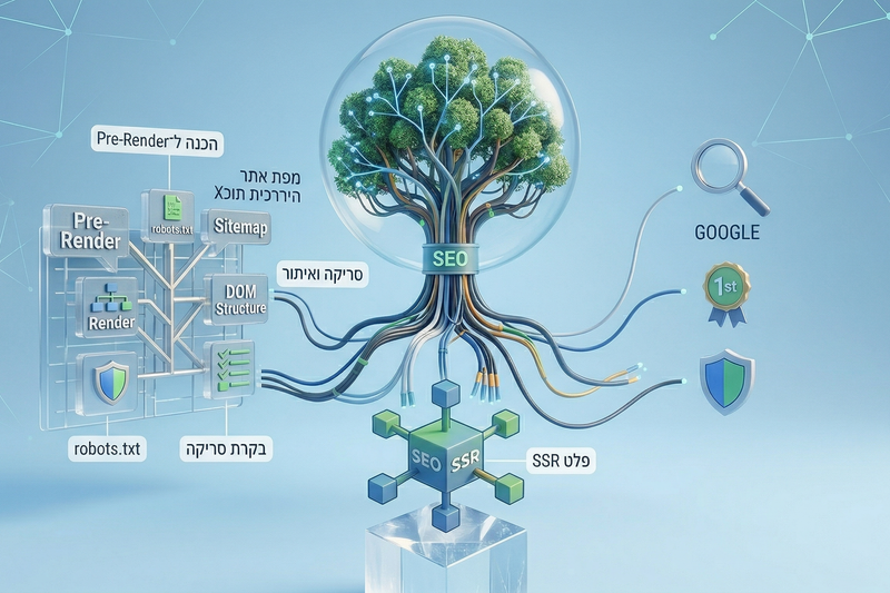
קידום אתרי Lovable – האם זה באמת עובד?
לאחרונה התחלנו לעבוד עם Lovable. זה מסוג הכלים שמרגישים כאילו נוגעים בעתיד - מהירות, יכולות, תוצרים. אבל עלתה שאלה חשובה: האם אפשר לקדם אתר כזה בגוגל? התשובה היא כן. אבל צריך להבין איך זה עובד באמת.
קרא עוד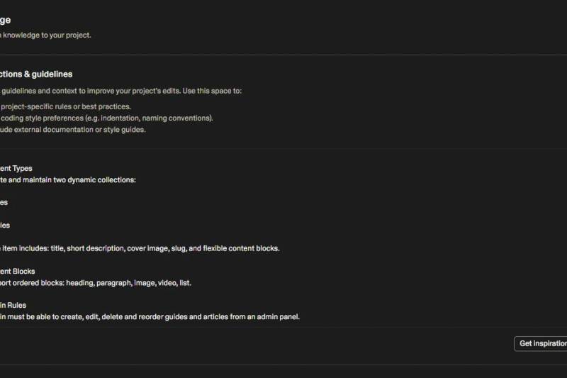
Knowledge base = המוח של הפרויקט
בכל פרויקט שמפותח עם Lovable, קובץ ה־Knowledge Base הוא הרכיב הקריטי ביותר. מדובר בקובץ טקסטואלי פשוט, אך המשמעות שלו עצומה: הוא "המוח" של המערכת – הוא מה שמאפשר ל-AI להבין את ההקשר, היעדים, והתנהגות הפרויקט שלך בכל פקודה.
קרא עוד
איך לבנות נכון עם Lovable: שיטה שעובדת לאורך זמן
פיתוח עם מערכות AI כמו Lovable יכול להרגיש לפעמים נפלא, ולפעמים כמו כאוס מוחלט. אותו כלי שמסוגל לבנות מערכת שלמה בדקות, יכול גם להיכנס ללופים, לשבור לוגיקה קיימת או לבצע שינויים שלא ביקשת. ההבדל בין חוויה מתסכלת לבין חוויה עוצמתית טמון כמעט תמיד בשיטה.
קרא עוד
מהמחשבה למוצר עובד
איך להפוך רעיון לאפליקציה או מערכת בעזרת AI – בצורה נכונה
קרא עוד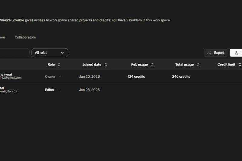
עבודה בצוות בפרוייקט Lovable
שיתוף פעולה מאפשר למעצבים, מפתחים, אנשי שיווק ומנהלי מוצר לעבוד על אותו מוצר, לראות שינויים בזמן אמת ולשמור על שליטה מלאה בהרשאות.
קרא עוד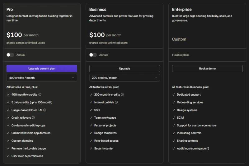
חבילות, קרדיטים ומה שביניהם - המדריך המלא
Lovable פועלת במודל של מנוי חודשי או שנתי, הכולל תוכנית חינמית ותוכניות בתשלום. בכל התוכניות משתמשים במערכת קרדיטים, אשר נצרכים בעת שליחת הודעות ל־AI וביצוע פעולות.
קרא עודשאלות נפוצות לפני שמתחילים
מתלבטים אם להתחיל ממדריכים חינמיים או מקורס מובנה? הנה התשובות.
איפה אפשר ללמוד פיתוח אפליקציות עם בינה מלאכותית בישראל?
ב-Lovable Israel אפשר ללמוד פיתוח אפליקציות עם בינה מלאכותית בעברית, בקצב אישי ובצורה דיגיטלית. הקהילה מציעה מסלולי לימוד מובנים ב-Lovable ו-ווייב קודינג, מדריכים חינמיים שלב-אחר-שלב, מאמרים עדכניים וספריית פרומפטים מוכנה לשימוש. התהליך מתאים למי שמתחיל מאפס וגם למי שכבר בונה ורוצה ללמוד לעבוד נכון עם AI — מהגדרת הרעיון, דרך בניית המסכים, חיבור מסדי נתונים ותשלומים, עד העלאת האפליקציה לאוויר.
האם עדיף ללמוד פיתוח אפליקציות עם AI דרך מדריכים חינמיים או קורס מובנה בעברית?
Lovable Israel מציעה את שני הערוצים בעברית, והבחירה תלויה במטרה שלכם. אם אתם צריכים תשובה נקודתית — למשל איך מוסיפים אימות משתמשים, מחברים תשלומים או מבצעים אוטומציה — המדריכים החינמיים באתר הם הדרך המהירה ביותר: הם פתוחים לכולם, מחולקים לנושאים ומתעדכנים לפי שינויים בפלטפורמה. אם אתם רוצים ללמוד מאפס איך בונים אפליקציה שלמה — מהרעיון, דרך המסכים, מסד הנתונים, החיבורים והעלאה לאוויר — קורס מובנה ב-Lovable ובווייב קודינג יחסוך לכם את הניחושים, כי השיעורים בנויים בסדר נכון וכל פרק מתבסס על הקודם. הקהילה הישראלית בפייסבוק משלימה את התמונה: שם אפשר לשאול שאלות, לראות פרויקטים של אחרים ולקבל עזרה בזמן אמת.
מה בדיוק מקבלים בחינם ב-Lovable Israel?
ספריית מדריכים מלאה בעברית, מאמרים עדכניים על בנייה ב-AI, ספריית פרומפטים מוכנים להעתקה, וקהילה ישראלית פעילה בפייסבוק — הכול פתוח ללא הרשמה.
מתי כדאי לעבור לקורס מובנה?
כשאתם רוצים תוצאה מקצה לקצה ולא רק תשובות נקודתיות. באתר יש שני מסלולים: מיני קורס לטעימה מהירה, והקורס המלא שמכסה את כל התהליך של בניית אתר או אפליקציה מקצועית עם Lovable — כולל פרויקטים מלאים, קהילה פרטית ועדכונים שוטפים.
פרויקטים מהקהילה
השראה מפרויקטים שנבנו ב-Lovable

SmartMoney77 — מחשבונים פיננסיים חינמיים
פלטפורמה חינמית עם 32 כלים פיננסיים (31 מחשבונים + אתגר FOMO) ב-6 שפות ו-22 מטבעות. מראה לצעירים את ההשפעה ארוכת-הטווח של החלטות כספיות יומיומיות — מריבית דריבית ועד עלות ההמתנה.
מאת Amiel Riss


פילדס - FILLDS FORMS
טפסים מקצועיים, ממותגים ומעוצבים המעניקים חוויה מיוחדת לכל מי שממלא אותם. דשבורד ניהול אחד-מסודר, נגיש וקל לתפעול. שלל פיצ'רים מתקדמים
מאת fillds forms

Car Reminder
ניהול כלי הרכב מתזכורות חכמות ומותאמות אישית ועד תיעוד תאונות וטופס מוכן לביטוח
מאת Ofek Edelshtain

CLOSER
Closer הופכת הצעות מחיר ללינק מקצועי במקום PDF: מיתוג, שירותים, מחיר וכפתורי יצירת קשר. נראות של אתר, יותר אמון, יותר עסקאות, בפחות מדקה לינק אחד שסוגר עסקאות Closer – הצעה חכמה!
מאת ALPHA VIBE ADV - ויקי רחמנוב


StudiesGo - הופכים כל חומר לימודי לקורס מותאם אישית
התחלתם ללמוד מקצוע חדש ואין לכם מושג מה הולך שם? במקום לשבור את הראש על סיכומים, העלו סיכום, מצגת או כל חומר לימודי של אותו המקצוע - אנחנו נבנה ממנו קורס אינטראקטיבי מלא עם שיעורים, תרגול ושאלות.
מאת שי שורץ
אתר זולו וט - מרפאה וטירינרית בחולון
אפיון והקמת אתר זולו וט. מימוש עיצוב לפי שפת המותג.
מאת בוריס קימלמן